Oh Google Maps, what have you done?

They’re not roundels!
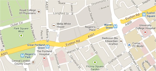
We first spotted it on Monday morning – when skimming through Google Maps, and we noticed that the blue & red ’roundel’ symbol used to represent tube stations on Google Maps had been replaced… by a white ‘M’ on blue – the same symbol as used on the New York Subway – ‘M’ for Metro, presumably? (The same symbol which is incidentally used in the UK, up in Newcastle on the Tyne & Wear Metro system)
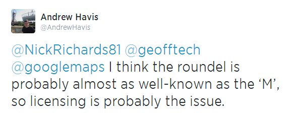
Some people speculated that it might not be a Google error, but TfL clamping down on the use of the roundel symbol.

Licensing issue?
But hang on – if that’s the case, then why was the roundel still in place on Google Maps for the London Overground – where the colours are slightly different! That doesn’t make sense.

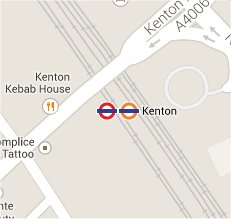
Kenton has both
We then noticed that in some places where tube stations AND Overground stations are the same station, then the tube roundel still existed alongside the Overground roundel.
But this didn’t apply to all places – at Harrow & Wealdstone, the ‘M’ symbol was in place instead of the tube roundel (alongside the Overground roundel and the NR symbol which is correct)
Then, a news story popped up from ITV London news on Wednesday, reporting that Google knew about it, “There are currently engineering works on the Google Line. Normal services will be resumed shortly.”
Londonist ran an article on it too, reporting the same thing.
Then – to compound the issue – this morning we now note that DLR stations in London have had their symbol replaced by the National Rail ‘BR’ type symbol too! Which is also completely wrong …

DLR now National Rail!
So with it looking like it’s getting worse, rather than getting better – maybe it’s time to resort to a Twitter trend to get this fixed! #GiveUsBackOurRoundel – anyone?

Let’s get it trending!
