Main menu: Home Features 3D Maps User Guide Support Buy Now Disused Tube Blog

Roundel me this, Google

Oh Google Maps, what have you done?

They're not roundels!

They’re not roundels!

We first spotted it on Monday morning – when skimming through Google Maps, and we noticed that the blue & red ’roundel’ symbol used to represent tube stations on Google Maps had been replaced… by a white ‘M’ on blue – the same symbol as used on the New York Subway – ‘M’ for Metro, presumably? (The same symbol which is incidentally used in the UK, up in Newcastle on the Tyne & Wear Metro system)

Some people speculated that it might not be a Google error, but TfL clamping down on the use of the roundel symbol.
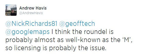
Licensing issue?

Licensing issue?

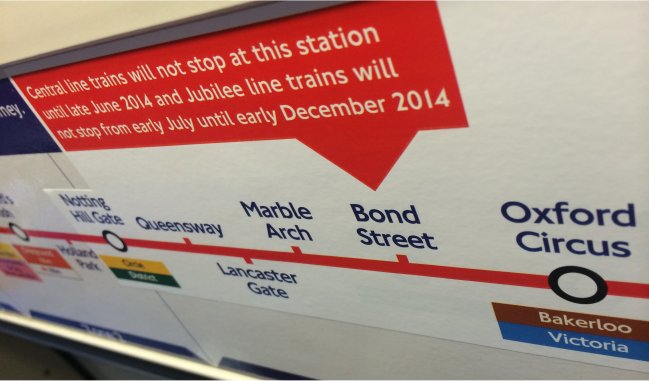
But hang on – if that’s the case, then why was the roundel still in place on Google Maps for the London Overground – where the colours are slightly different! That doesn’t make sense.
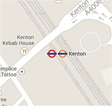
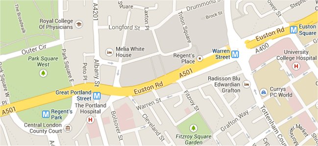
Kenton has both

Kenton has both

We then noticed that in some places where tube stations AND Overground stations are the same station, then the tube roundel still existed alongside the Overground roundel.

But this didn’t apply to all places – at Harrow & Wealdstone, the ‘M’ symbol was in place instead of the tube roundel (alongside the Overground roundel and the NR symbol which is correct)

Then, a news story popped up from ITV London news on Wednesday, reporting that Google knew about it, “There are currently engineering works on the Google Line. Normal services will be resumed shortly.”

Londonist ran an article on it too, reporting the same thing.

Then – to compound the issue – this morning we now note that DLR stations in London have had their symbol replaced by the National Rail ‘BR’ type symbol too! Which is also completely wrong …

DLR now National Rail!

DLR now National Rail!

So with it looking like it’s getting worse, rather than getting better – maybe it’s time to resort to a Twitter trend to get this fixed! #GiveUsBackOurRoundel – anyone?

Let's get it trending!

Let’s get it trending!

03 Jul 14

Central Stickers

There are now some nice big bright stickers on Central Line carriages, in bold red pointing out the fact that trains aren’t currently stopping at Bond Street, by removing its connection blob.

No connection

No connection

What we can’t work out though is why they felt the sticker needed to cover up Notting Hill Gate, Queensway, Lancaster Gate and Marble Arch as well when absolutely nothing map-wise has changed about these stations.

With connection

With connection


22 May 14

A real good service

One of the things which we like to grumble about the most (and we hear others do too – including drivers) is the fabled ‘Good Service‘ announcement which plagues our eardrums on platforms and stations, and often gets automatically announced by a system which isn’t good enough to react quickly to situations on the tube where it’s gone wrong.

Nothing is more annoying when tube travelling than (say) the time when we waited 23 minutes for a Piccadilly Line train whilst being told several times that there was a ‘Good Service‘ when there clearly wasn’t.

Which is why we love this – Andy Drizen’s Tube Map Live. Yes we’re plugging another App which we have no problem doing here if it’s one we really love, and we really love this one. Andy first produced the excellent Tube Tracker, and then subsequently came up with Tube Map Live, which plots the positions of the trains (from a feed from TfL) on a tube map.

The result? You can actually see for yourself the gap between the trains on any particular line, and thus judge for yourself if there really IS a ‘Good Service‘ or not.

Tube Map Live!

Tube Map Live!

Instead of the wasted money on the ‘rainbow board’ in every station bleating on about there being a good service, how great would it be if all stations actually had a display like this, showing you how the trains were actually running.  In the meantime, download the App (it’s free!), and watch them for yourselves.  Sometimes we watch them, just for fun – even if we’re not taking a journey anywhere!

28 Feb 14

Strike Wednesday (Afternoon Update)

2pm – Based on the latest information again from TfL we’ve updated our tube strike map. They are reporting that the Victoria Line is now running all the way to Brixton, and Central Line services now going all the way to Holborn, and round the Hainault Loop.

tube map 4 650

05 Feb 14

Strike Wednesday

9am – Based on the latest information from TfL, we’ve updated our map

Summary : No Bakerloo Line, Central Line is running to Ealing Broadway, the Piccadilly from is Acton Town only going as far as Hatton Cross – not Heathrow, Victoria Line is now going to Stockwell and some of the frequencies have changed for the better. The Bakerloo Line might open later in the day. The Northern Line is reporting a ‘Good Service’ !

strikemap650_3


05 Feb 14

Tube Strike Map

[See our post “Strike Thursday” for the latest Strike Map and information!]

With it looking increasingly likely that the tube strike is not going to be called off, Station Master has taken TfL’s list of tube services that it says it is hoping to have running, and turned it from a hard-to-understand list, into an easy-to-look at map – showing lines and stations that are opening with expected train frequencies in minutes.

Tube Strike Map

Tube Strike Map – Click for full size image

We’ll live update this on Wednesday and Thursday as/if and when the situation changes.

04 Feb 14

Abandoned and Disused

When the BBC ran a story a few weeks back on the allure of disused tube stations, they linked to a Ghost Station of the London Underground map which had us gasping slightly about various aspects of it.

First, it had used a version of the map that had the ELL dotted out whilst in ‘bus replacement’ mode, the zones had been left in, as had ugly connector blobs and blue-accessibility-blobs which just made it look ugly.  They even included the DLR, whilst missing the fact that there are a couple of resited stations on that too!

There was no clarity between what was a proper abandoned/disused station (e.g Aldwych) and what had been re-purposed as something else (e.g the Bakerloo Line stations up to Watford that became National Rail and now London Overground).

Also, there were some glaring errors with Grove Road and Uxbridge Road stations (in the Hammersmith / Shepherd’s Bush area) actually being London & South West Railway stations, and never part of the London Underground. They’d also missed out things like Hyde Park Corner and Euston having old abandoned surface buildings, which the ardent tube-geek might like to go and spot today.

So we made from scratch (drawn ourselves, not editing a current day version of the official map) our own version, a nice, clean, and accurate map of just disused and abandoned tube stations, showing everything – correctly – in the right place, with a key to help you distinguish between the different types.

Abandoned Stations

Abandoned Stations

With thanks to Bed Pedroche for his help.  Click on the image for the full size, it’s a large size image, and needs to be!

28 Jan 14

Blobby blobby blobby

Hammersmith Blue BlobWe’ve finally had a chance to analyse and look at the differences between the latest tube map, and its previous incarnation to see what’s different, apart from just the new cover design.

And (as it often does), it just comes down to the fact that more blue ‘accessibility’ blobs have been added, in this case – replacing some that were previously white blobs.

In case you’re still confused by the difference between them, a blue blob is complete step-free access from street to platform to train, whereas a white blob indicates that although it’s step-free to platform, there is a height difference between the platform and the train.

So with the new S7 trains now practically completely rolled out to the Hammersmith & City line, Hammersmith H&C station has been upgraded from a white blob to a blue one. Likewise at King’s Cross where, again, it’s become a blue from white – although Farringdon still remains white.

The map now reflects all the ‘platform humps’ that have been installed on the Northern Line, which have been there for a while but the official map has now finally caught up – High Barnet, Finchley Central and Morden are all now blue-blobbed-up.

In the meantime, we’re working on our own much-cleaner to look at blob-free accessibility map, which we’ll publish here when it’s done.

25 Jan 14

London Tube Stats

This caught our attention yesterday.

Ollie has made a superb data-visualisation website called London Tube Stats that shows you where people enter and exit the Tube, and where they go once on board.

You can choose an option from the drop-down menu at the top to change the view, or click on a specific station to show you the stats just for there.

londontubestats


22 Jan 14

Oyster Shaped London

Last week, those nice people at Londonist ran a story with a map that we provided for them showing the real layers of where the Oyster fare zones are in London.   They had a couple of discrepancies in them though, which we’ve now tided up, and the latest version is below.   Click on the map for a larger full-screen version.

The grey and white shaded areas are fare Zones 1-9 starting with Z1 which is white in the centre, also shown is where the Cycle Hire scheme is (in blue), and the congestion charging zone (in red).  The edge of the London Boroughs are then shown with the orange line.

Oyster Map

Oyster Map


19 Jan 14