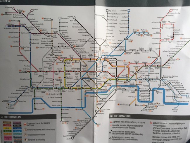
Some visiting friends from Spain popped over to London recently, and with them they brought an old travel guide of London that they had on the shelf at home, which contained a map of the London Underground, “We can use that!” they thought. Here’s the map …
Straight away you can see from the lack of Overground that this is an old map, but that the presence of the North London Line which goes all the way down to to North Woolwich which closed in 2006, shows that map they’re using is at least ten years old!
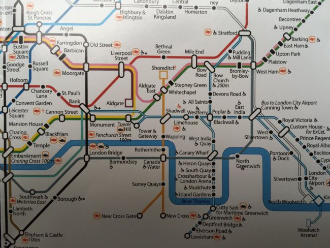
The station ‘blobs’ are an intruiging design themselves, as are the wide white connector blobs which is something that we’ve not seen before. Here’s a zoomed up picture of the central area:
Here you can see some rather wonderful square-shaped terminus symbols (at Aldgate and Shoreditch) which are most unusual. What we do like though is it show how the Tube map might look if the blue-wheelchair-blobs were removed, and the wheelchair symbol just used next to the station name instead as some suggest. It looks a bit cluttered though when you realise that every station on the DLR has it.
A label saying ‘Charing Cross 100m’ rather nastily crashes into the Thames, and best of all is the most religious station on the network – look between Leicester Square and Holborn and you’ll discover Convent Garden !

