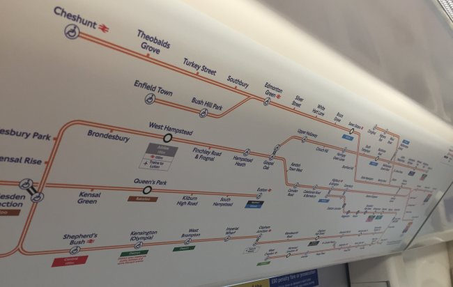
With the addition of the new Overground stations in London, it was only a matter of time before the carriage maps got updated, and they look like this …

Overground Carriage Map
Which is quite frankly a bit of a mess, because now the whole orangey-network of Overground lines have been squeezed into a shape that is not suitable for them. But most importantly, the topological layout has been completely distorted, and there’s no way that you would use this as any sort of journey planner for the Overground.
Why not just put Tube maps (which should be called the TfL map anyway, because that’s what it really is) up in Overground trains, which would help people plan much better journeys. By having Overground lines up in carriages shown only on those trains, it might make you take a journey purely by Overground that would be much quicker if you used instead used a tube line!
It’s a right old mess … so much so that you should read Diamond Geezer where he calls it “TfL’s worst map”, which is hard to disagree with.


 And Station Master Geoff got invited on to talk all things Tube trains, and answer your questions! We also naturally gave Station Master a plug as well.