Main menu: Home Features 3D Maps User Guide Support Buy Now Disused Tube Blog

Station Master Tokyo

2nd February 2014
 

New York and Paris may be on our radar once we’ve published every conceivable piece of information about the London transport system – seems maybe though that the Tokyo market may not be one we would have success in though.

“No need for the Station Master App in Tokyo”, our friend Anthony shared with us this week as he’s on a trip over there.  There are screens above every door in all carriages which show you where the exits, escalators and lifts are in relation to the whole length of the train.

Tokyo Subway Display

Tokyo Subway Display

This is something that LU could/really should consider doing to trains here – except I’d take it even further.  It should be possible at interchange stations (e.g. Oxford Circus) if that you [let’s say] approach on the Bakerloo Line, you can see as you approach Oxford Circus if the next Central Line train that you might be changing on to is an Ealing Broadway train or a West Ruislip one.  i.e. if it’s in two minutes (the train that you want) then you wouldn’t dawdle on the interchange. If you can see it’s in 6 minutes, you can take your time walking.

Best of all, if you could perhaps see (by showing 4 or 5 instances of the next train – which is what all platforms need anyway) by the service pattern if it was broken or not, and if it wasn’t you could stay on the Bakerloo Line train and change elsewhere, instead of only discovering this when you got to the Central Line platforms.

How about it TfL? ‘Next train’ information displays INSIDE all other trains please! Or make them touchscreen so you can choose different lines, and not just the one you’re already on or are about to change to at the next station.



Mind the Cappuccino

1st February 2014
 

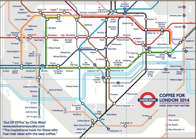
After the alternative concept map last Saturday, this week a new variant! Maybe Saturdays will develop into the alternative-map-day, we’ll see.

So this was doing the rounds on the internet yesterday, created by Chris Ward who spends his working life in various coffee shops around London.    We can’t but help wonder if there will now be people who will go out and try and visit them all to say they’ve been to all of them.

Tube Coffee Map

Tube Coffee Map


Wimblaydon Trams

31st January 2014
 

Although Station Master doesn’t currently include information for tram stations, it’s something we think we’re quite likely to put in a future update.   This means we’ve always got our ear to the ground about any future Croydon Tramlink developments, and we heard some earlier this week.

We were at the London Transport Museum on Monday night to hear Nick Baker (Head of Operations at Tramlink) to give a talk on the future.  There’s always speculation about possible extensions, proposals and he put some of the rumours to bed.

Something we didn’t know (but was speculated here on London Reconnections a while ago) was the confirmation that Wimbledon station is to be re-designed so that there are two platforms for Tram services, meaning that the service will increase there to 12 trams per hour.

Wimbledon Tram Extension

Wimbledon Tram Extension

Nick ended his talk with the confirmation that extensions such as Crystal Palace, and Morden to Sutton may go ahead, but others that have been rumoured in the past such as Streatham and Brixton will – in all probability – never happen.

Station Master is still busy working away on getting its 3D maps drawn up for every tube station (We’ve done 90% of the tube network now), so once we’ve done that, it may be time to collect the data for every tram stop!


ExcelLink

30th January 2014
 

We popped down to the Excel centre yesterday, to take a sneak preview at the new 12-car Thameslink train which should be hitting the north-south rails of London by 2015. Although possibly the most interesting discovery that we didn’t know about was not the train itself, but the fact that there’s a new tunnel that’s been constructed which means that trains from St. Pancras heading north can link up with the line out of King’s Cross to Cambridge, and other destinations.

We wandered round the mock up train, lots of signage and information telling us how all wonderful and sexy the future is going to be be, whilst actually discovering that the amount of legroom for people sitting down isn’t great for tall people and felt more cramped than trains you get running local suburban service out of London.

New Thameslink Train

New Thameslink Train

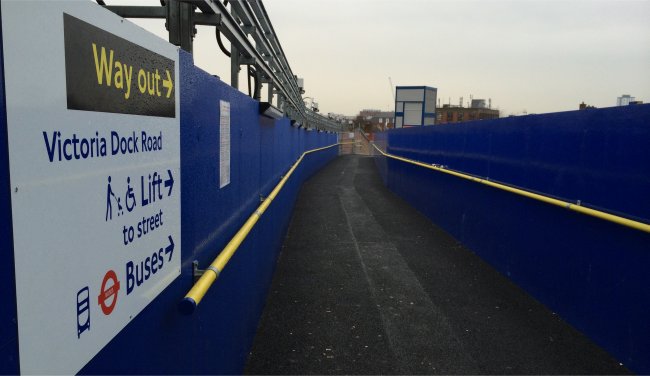
A side bonus was seeing the construction works of Crossrail close by, and a change to Royal Victoria DLR that we didn’t know about. It’s now impossible to enter/exit the north side of the station using the escalator route at the eastern end, instead a new temporary footbridge (although one that I suspect shall be there for a couple of years) had been built at the western end of the station, with a new lift, and a whole new load of stairs for us to count. Expect that data to be in the next updated version of the App.

Royal Victoria Exit

Royal Victoria Exit


The blurry gateline

29th January 2014
 

Without doubt, the funniest tube related video going round at the moment, is the ticket barrier on the gateline at Canary Wharf that sings a Blur song at you.   Not sure how that can be? Play the video … we’ll be popping down to Canary Wharf later ourselves to investigate…


Abandoned and Disused

28th January 2014
 

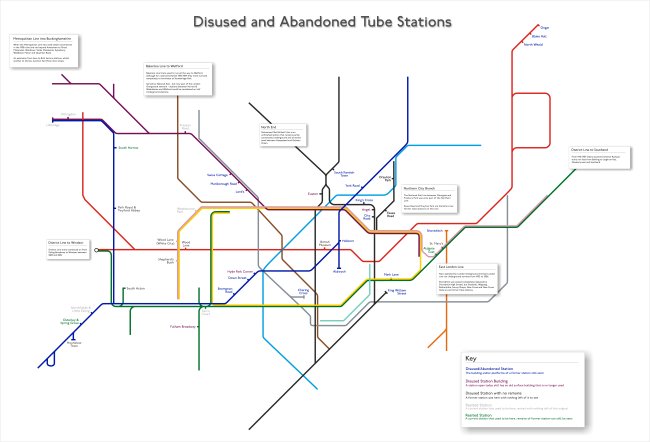
When the BBC ran a story a few weeks back on the allure of disused tube stations, they linked to a Ghost Station of the London Underground map which had us gasping slightly about various aspects of it.

First, it had used a version of the map that had the ELL dotted out whilst in ‘bus replacement’ mode, the zones had been left in, as had ugly connector blobs and blue-accessibility-blobs which just made it look ugly.  They even included the DLR, whilst missing the fact that there are a couple of resited stations on that too!

There was no clarity between what was a proper abandoned/disused station (e.g Aldwych) and what had been re-purposed as something else (e.g the Bakerloo Line stations up to Watford that became National Rail and now London Overground).

Also, there were some glaring errors with Grove Road and Uxbridge Road stations (in the Hammersmith / Shepherd’s Bush area) actually being London & South West Railway stations, and never part of the London Underground. They’d also missed out things like Hyde Park Corner and Euston having old abandoned surface buildings, which the ardent tube-geek might like to go and spot today.

So we made from scratch (drawn ourselves, not editing a current day version of the official map) our own version, a nice, clean, and accurate map of just disused and abandoned tube stations, showing everything – correctly – in the right place, with a key to help you distinguish between the different types.

Abandoned Stations

Abandoned Stations

With thanks to Bed Pedroche for his help.  Click on the image for the full size, it’s a large size image, and needs to be!


Wait before you save someone’s life

27th January 2014
 

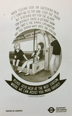
PEA1 We’re rather confused about this current poster campaign on the Tube.   Cute little rhyming posters asking you to do things a certain way.   Ok, now disposing of newspapers is one thing (even though I and many others like getting on a train and having something to read in the form of a discarded newspaper), but asking people to wait until you try and help someone who’s ill is .. odd, as far as we can see.

This Station Master had cause to use the PEA last year (Passenger Emergency Alarm), when shortly after pulling out of East Acton station heading into London, another passenger collapsed on the floor in front of us.   We immediately pulled the alarm, spoke to the driver – who, with a whole 2 minutes ahead of him until White City was able to speak to the Line Controller, who in turn made sure that there was somebody already on the platform by the time our train pulled in.   This meant that help was brought to that person far more quickly than if we’d have waited UNTIL the train was in the platform, and then pulled the alarm.

Also, it meant that the Line Controller was able to route the eastbound train immediately behind us (and others) through the middle platform at White City, and not have it delayed behind us.

So – serious question TfL – why are you advising people to wait until the next station until the alarm is pulled?  The few minutes that it takes to get to the next station can be used to arrange help – perhaps life saving help, rather than waiting until the train gets there. Wouldn’t you want to get help to someone more quickly, rather than slowly?

PEA2


Tube Concept

26th January 2014
 

It’s a little out of date, because it’s for 275 stations (and not 270 as there now are), and we can’t even remember where it came from to credit it properly, but out of all the ‘alternative’ tube maps that get flung around the internet, this is still one of our favourites.  Conceptual!

Conceptual Tube Map


Blobby blobby blobby

25th January 2014
 

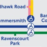
Hammersmith Blue BlobWe’ve finally had a chance to analyse and look at the differences between the latest tube map, and its previous incarnation to see what’s different, apart from just the new cover design.

And (as it often does), it just comes down to the fact that more blue ‘accessibility’ blobs have been added, in this case – replacing some that were previously white blobs.

In case you’re still confused by the difference between them, a blue blob is complete step-free access from street to platform to train, whereas a white blob indicates that although it’s step-free to platform, there is a height difference between the platform and the train.

So with the new S7 trains now practically completely rolled out to the Hammersmith & City line, Hammersmith H&C station has been upgraded from a white blob to a blue one. Likewise at King’s Cross where, again, it’s become a blue from white – although Farringdon still remains white.

The map now reflects all the ‘platform humps’ that have been installed on the Northern Line, which have been there for a while but the official map has now finally caught up – High Barnet, Finchley Central and Morden are all now blue-blobbed-up.

In the meantime, we’re working on our own much-cleaner to look at blob-free accessibility map, which we’ll publish here when it’s done.


Victoria Line set in Stone

24th January 2014
 

Victoria BricksYesterday’s ‘flooding‘ in reality turned out to be a brand new reason as to why the Tube was delayed. It rapidly transpired that it wasn’t just water that had leaked into a signal control room at Victoria, but as part of the £695m upgrade to the station the workmen/contractors had somehow managed to fill up a signal relay room with a few feet of wet cement.

Website Us Vs Th3m got the scoop on the photos (no word as to how they were leaked, we’re guessing that someone high up in TfL was NOT happy about that). Also, with some people predicting that it might be a whole week until it was all removed and cleaned up, it was good to know that people had clearly worked very hard overnight to clear it up, and the Victoria Line was back to a normal service this morning.

Twitter descended into a plethora of puns yesterday, with the obvious gags being of ‘Wanting concrete evidence’, ‘Mortar follow’, and ‘Workman responsible fears he may become hardened criminal’, and of course ‘The Circle Line is now the Blue Circle Line’ [Blue Circle is a manufacturer of cement]. But our favourite was actually from user @paulsilburn who came up with this:

‘Concrete on the Victoria line is affecting services to Brickston and connections to the Cementral Line’