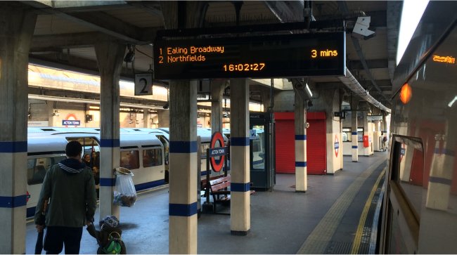
One of the things which we like to grumble about the most (and we hear others do too – including drivers) is the fabled ‘Good Service‘ announcement which plagues our eardrums on platforms and stations, and often gets automatically announced by a system which isn’t good enough to react quickly to situations on the tube where it’s gone wrong.
Nothing is more annoying when tube travelling than (say) the time when we waited 23 minutes for a Piccadilly Line train whilst being told several times that there was a ‘Good Service‘ when there clearly wasn’t.
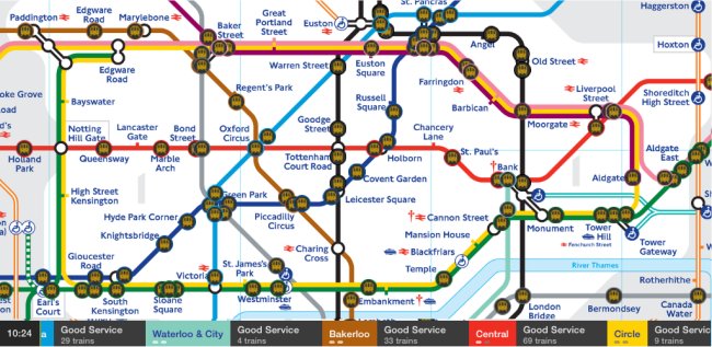
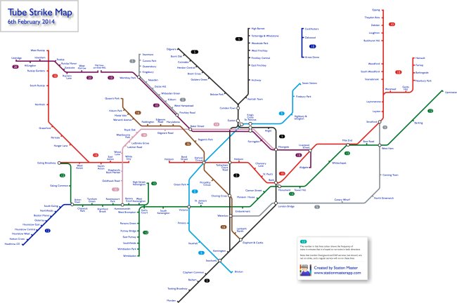
Which is why we love this – Andy Drizen’s Tube Map Live. Yes we’re plugging another App which we have no problem doing here if it’s one we really love, and we really love this one. Andy first produced the excellent Tube Tracker, and then subsequently came up with Tube Map Live, which plots the positions of the trains (from a feed from TfL) on a tube map.
The result? You can actually see for yourself the gap between the trains on any particular line, and thus judge for yourself if there really IS a ‘Good Service‘ or not.
Instead of the wasted money on the ‘rainbow board’ in every station bleating on about there being a good service, how great would it be if all stations actually had a display like this, showing you how the trains were actually running. In the meantime, download the App (it’s free!), and watch them for yourselves. Sometimes we watch them, just for fun – even if we’re not taking a journey anywhere!
