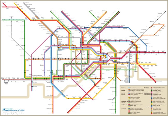
We can’t believe we hadn’t stumbled on this sooner .. this was doing the round on twitter today, when it appeared as a link on the TransitMaps Tumblr, but it’s actually by the rather brilliant Max Roberts, who has created literally loads of different transit maps.
It’s a map of the tube, but done in ‘Vignell’ New York style – where the map shows the actual pattern of services. Look at how complicated Earl’s Court becomes for example – but rather beautifully shows how the service to Olympia actually is.
More over on Max’s own website here, of course.
