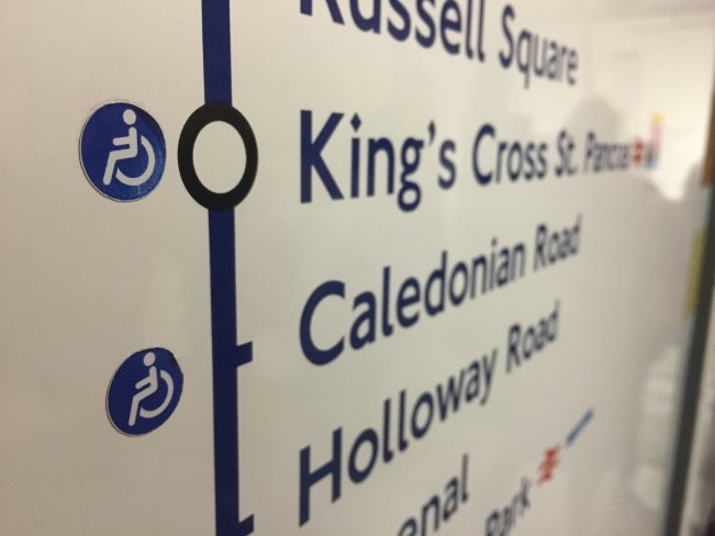
Accessibility blobs! Do you love ’em, or hate ’em? It’s essential to know of course these days which stations have step-free accessibility and which don’t, but some argue that the main Tube map has been disrupted by too much information pollution (not just with accessibility blobs, but with all information on the Tube map) and that there should be once ‘simple’ standard Tube map for the majority of users, and then specialised versions for others.
The main issues that people have always had with ‘wheelchair blobs’ (as they’ve become known) is that on a standard Tube map, there are ‘ticks’ and then circular ‘connector blobs’ to represent stations which are and aren’t interchange points.
When a station then gets a ‘wheelchair blob’ it becomes circular in shape, and then there’s no way of knowing if its meant to represent an interchange station or not – therefore rendering the regular connector blob pointless.
Which is why we were intrigued to see this at Covent Garden station the other day, on a map on the wall, where the wheelchair blobs have been stuck to the side of of the regular tick/connector blobs of stations. A really nice touch, the first time we’ve seen it, and something that we wish was more prevalent.
