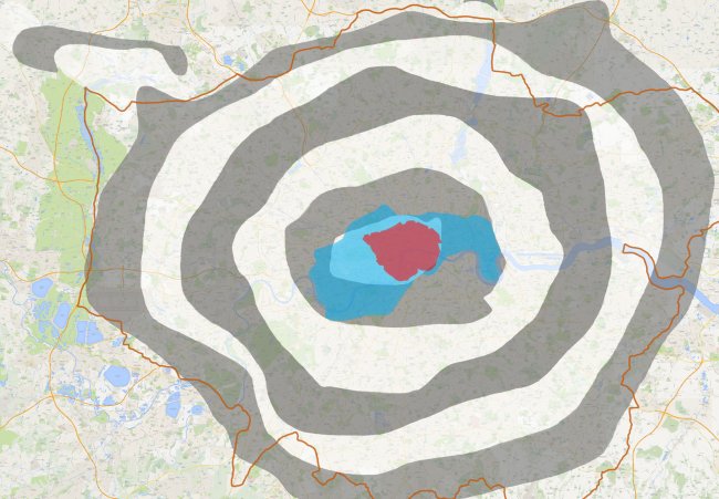
Last week, those nice people at Londonist ran a story with a map that we provided for them showing the real layers of where the Oyster fare zones are in London. They had a couple of discrepancies in them though, which we’ve now tided up, and the latest version is below. Click on the map for a larger full-screen version.
The grey and white shaded areas are fare Zones 1-9 starting with Z1 which is white in the centre, also shown is where the Cycle Hire scheme is (in blue), and the congestion charging zone (in red). The edge of the London Boroughs are then shown with the orange line.
