 We’ve finally had a chance to analyse and look at the differences between the latest tube map, and its previous incarnation to see what’s different, apart from just the new cover design.
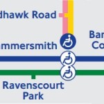
And (as it often does), it just comes down to the fact that more blue ‘accessibility’ blobs have been added, in this case – replacing some that were previously white blobs.
In case you’re still confused by the difference between them, a blue blob is complete step-free access from street to platform to train, whereas a white blob indicates that although it’s step-free to platform, there is a height difference between the platform and the train.
So with the new S7 trains now practically completely rolled out to the Hammersmith & City line, Hammersmith H&C station has been upgraded from a white blob to a blue one. Likewise at King’s Cross where, again, it’s become a blue from white – although Farringdon still remains white.
The map now reflects all the ‘platform humps’ that have been installed on the Northern Line, which have been there for a while but the official map has now finally caught up – High Barnet, Finchley Central and Morden are all now blue-blobbed-up.
In the meantime, we’re working on our own much-cleaner to look at blob-free accessibility map, which we’ll publish here when it’s done.